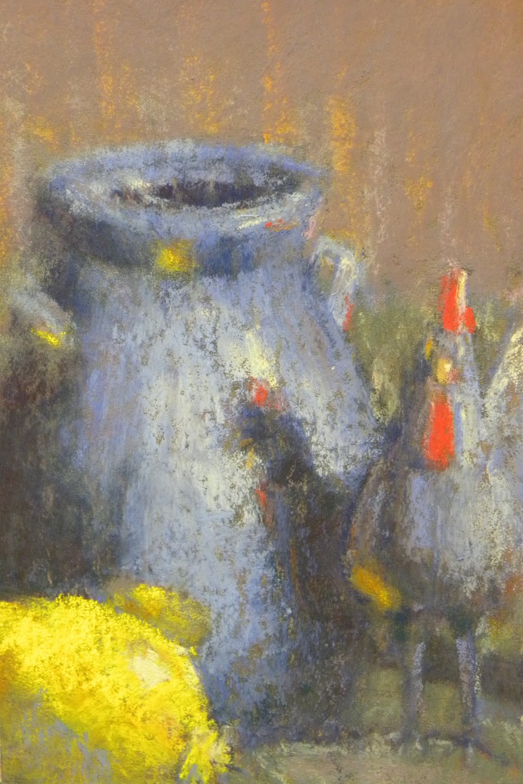
Examples of yesterdays post
Yesterday I posted my process for creating a value scale under painting. The one yesterday didn't turn out as well as I would like so here is another example. This is of a still life that I completed today. The under painting is done with a dark purple hard pastel and then pushed around with turpentine. The values created with this under painting are very close to the final values in the painting. The most noticeable exception being the background. Since the primary objects are the primary colors I subdued the background and cloth with grayed secondary colors. In the under painting the background has dark and light stripes but as I was working I realized the vertical stripes needed to have less contrast because it drew attention up and away from the primary objects. With the under painting the amount of solvent used was more conservative than the one from yesterday. Also if you look back from a few days I did the color studies for this. The color studies looked good but the background had to be changed as mentioned above. This is a small 6x9 painting and there will be a larger one following. This painting gave me a good grip on the changes that need to occur for the larger one to be a success. Practice and studying the process, if all goes well, will lead to better understanding of the subject and better paintings. Daily paintings in oil, pastel, and watercolor along with sketches and design theory.
Thursday, September 22, 2011
Wednesday, September 21, 2011
The next step in the process
Following on Monday's post I would like to pick up where I left off. On Monday the first step was finding something that catches your eye and then creating thumbnails to emphasise that thing. Today I am going to talk about getting things laid down on your pastel paper. Once the thumbnails are satisfactory I get a piece of sanded paper and lay down the outlines with vine charcoal. I have a lot of paper that has already been used so it needs to be wiped clean. If I am working with new paper the process is slightly different. Once the paper is fairly clean I lay down the outline which can be seen in the top photo. This is quick and just a reference for laying down my value scale. When laying down a value scale I use a dark purple but you could also use a dark warm color to get a warm effect for your shadows if you choose. From the photo below it is hard to tell what is happening but I'm simply pressing down harder in the darker value areas and using the slightest pressure in the lighter value areas. This should also be a quick process that gets masses filled in.
After I have my values set in I use turpentine or mineral spirits to push the pigment around. This step is to push the pigment around to fill in the background. It is the equivalent to using a wash in watercolor or oils. You are setting a map for the later layers to be derived from. During this step you have to be careful to not load up your brush with to much of the solvent or you will brighten your values up dramatically. As you can see in the bottom photo the solvent got away from me on the right side of the painting. The tree mass on that side had its pigment washed away with to much solvent. At this stage it is about responding to the pigment on the paper and it takes time to get used to. Once this step is done it will be a while before the solvent dries. Depending on the sun and wind it could take only a few minutes up to a half hour. It is during this drying period that I work on the next step of the process.
Tuesday, September 20, 2011
Oil break
Today I had planned on doing the next step in my process but I went to oil class and decided to post this up instead. We spent the first hour and a half talking about composition so we only had the last hour and a half to paint. I got to work quicker than I would have liked. I only did one quick sketch and decided to go for it. About half way through the painting I decided the front vase wasn't any good and almost threw the painting in the trash. Then I decided to give the palette knife a go. The palette knife is fairly alien to me compared to a brush and I liked it. I don't want to fall to heavy on the palette knife in the future but this painting turned out alright. The bottom photo shows that the values worked out and that always makes me feel confident in the painting. Monday, September 19, 2011
A journey through the process
Today I wanted to record my process for others to see and for myself to remember where I've been in the future. For this exercise I am starting out with a photo I took while driving to my parents house. These scenes are what I constantly try and capture. They are peculiar little places where you can see through the visual and physical barriers that separate natures rooms(or in the case of fields, man made). There are tree layers that are separated by two fields. The way one tree layer can be seen through catches my eye, and I want to recreate that sense of a veiled scene behind it. In landscape architecture classes we used to call it framing the scene, when you create an area with trees or man made objects that narrow the eyes onto something of beauty. A place as simple as a field with tall grasses or wildflowers if the case may be, is something that resonates with me. I remember walking through fields of tall grass when I was child and I remember running my hands through the top. Seeing the green-golden grass dance in the wind and a flat plain turn into a rolling ocean when the wind picks up is beautiful. That is what attracts me to scenes like this one. If I am painting in plein air I will set up and start the process in the field. For this painting I was just passing through so I went about and the process is replicated here at home.The first thing I do is a thumnail of the scene which is the top left corner. In this thumbnail I try and get things to be in the correct place for the most part and the light coming from the right angle. Once I have a thumbnail that is fairly representitive of the scene, I take away the original photo from my sight. This does a few things. It helps me work quickly, because I dont have any details of the scene in front of me. It make me idealize the shapes instead of over working them. Also the values can move towards what the design calls for. In the second thumbnail(top right) I begin moving shapes around to say what originally drawed my attention to the scene in the first place. In this case seeing through the layers to the back field. In this sketch I keep the light direction and mood the same. Looking at the thumbnail I may go ahead and start laying down the lines if everything looks good or re-work the sketch. At this point I thought the drawing needed a lead in. The drawing makes sense to me but if you didn't know what to look for the back field wouldn't pop out to you. With that in mind I begin thinking of ways to bring the viewer into the field. Looking at the shapes I realized that if the light source was moved there would be shadows cast down on the front field and a nice s curve would go directly where I want the attention. Also with the sun being in that direction and the shadows cast out like that it reads as it being dusk or dawn. Sometimes in the late afternoon before the sun begins to sink down a golden light will cast across the landscape. That got me thinking about color but that is a process that will be covered in a future segment. At this point I go over the thumbnail and it does a good job of leading into the scene and it brings the viewer right to where I'm painting about. At this point I put the sketch book down and get out the pastel paper. Tomorrow I will post the next step.
Sunday, September 18, 2011
Organizing my pastel carrier
This past week I got a new pastel box. This morning was spent arranging it. From left to right overall and in each compartment I arrange by color and temperature. Then top to bottom I arrange by value. As you can see from the black and white photo below the values are not completely correct but they are getting there. Currently I'm low on dark yellows and light purple and browns. For a good while I set in front of it mesmerized by the colors. The old pastel box I was using had trays that were stacked on each other. The color were split up into each category but you couldn't see them side by side like this when painting. Anyway I'm looking forward to using this new layout and can't wait to get back out in the field painting.Friday, September 16, 2011
Watercolor & Gouache
Today felt like a good day to get the watercolors out. The last time I started a new medium, my watercolors improved. I think it has something to do with seeing the paint in a different light. Before using pastels I only had watercolor to paint with so there was nothing to compare it to. After I started using pastels the watercolors started to become more understandable. I had another point to compare the medium and started to favor watercolor in man made objects and close ups. The pastels seemed to be better suited for natural landscapes. As I've developed my pastels toward a certain style the watercolors started to change as well. Now that I have oil as another reference the watercolors are starting to seem better defined in my mind. Working with oil there is no need to hurry or fuss over detail. It helped me relax and slow down when using the brush. While there is a certain speed required for the watercolors, I'm thinking I was over rushing things. The gradation change in the front trees would have gotten me worked up before but this time seemed different. I took my time and then used a heavier brush to push the pigment around even though it was slightly drier than typical. With it being drier it didn't push too much pigment like is typical and make the area almost bare. There is a lot of difference between oil and watercolor but my understanding of the pigments is starting to make sense. Also like last time I got out the gouache. There were areas that I thought needed lightened up and the gouache is very good for that. Mixing the gouache and the watercolor is still strange. It doesn't quite work out as well as I would think, but it is slightly better than last time. Just like pastel and oil, gouache is also another point of reference in the great scheme of painting. The plan is to learn all there characteristics and strengths. With time I think my paintings in the different mediums will start to mimic and become more like one another. Only practice and time will tell.
Thursday, September 15, 2011
Recent thoughts
The past couple of days during my free time I've had my thoughts drifting in the same direction so I focused my attention on them. Typically if I can't stop thinking about something it makes me curious as to why I'm thinking about it in the first place. The first thing that has been on my mind is still lifes. With fall here and winter steadily approaching the days of going out into the field and painting in plein air will be falling in number before to long. When I think about why painting in plein air is so attractive to me it made me realize that painting still life is much closer to plein air painting that I previously had thought. When you're painting in plein air you are reacting to real objects and getting a first hand look at natural nuances that easily go unnoticed unless you immerse yourself in the experience.With still life you are not feeling some of the more direct natural elements like weather and sunlight but you are seeing and reacting to a real object and the colors and form. Compared to working from photos or field studies you are truly reacting from the subject and not the illusion from a flat object portraying it. That doesn't mean that working from those references is wrong or bad in any way, in fact if you are trying to get photo-realistic results it is the way to go. However, that's not the results I'm looking for. I personally think working from life compared to flat references has helped me learn at a quicker pace and its more enjoyable. Unless the conditions are absolutely miserable there are few places I would rather be. So that's why I've been thinking about still lifes. The other subject that has taken my thoughts hostage is color studies and for good reason. The other day when I went and painted in plein air, I did a few color studies for one of the paintings and none for another. The painting that had color studies turned out much better than the one without. This may not always be the case but I've decided to see for myself. I began to look at my painting process and realized that this would add another step. While I'm not against adding steps to a process but if you do it better take time off of the total endeavour or make the finished product better. Painting is fun, but when constantly doing it be practical and look at it like any other work. I constantly look for ways to streamline my process and get better results (it would be a lot harder to do this if your work is at a high level already, but that doesn't mean you shouldn't try). Today while working on some still lifes I initially planned out some contour and value studies of the subject and then put it on the paper and did an under painting. While I was waiting for the two under paintings to dry, I began to realize that I had a few minutes of down time and typically it is filled with watching paint dry. While watching paint dry isn't always entertaining you can learn a few lessons about your paints and mediums. Those lessons do tend to get old after you see them enough times. So today, like this past plein air excursion, I did a few contour thumbnails and then took hard pastels and filled in the shapes. I did the typical local color study and then another with slightly different colors. I only did two today but your imagination is the limit on color combinations. These little studies only took me a few minutes like the studies from the other day. If all goes well this will cut down on the time needed to process concepts like color theory and refraction and reflection of light.(no refraction here but in landscapes with water that you can see through to the bottom and also see the reflection on top of it can get complicated and difficult to communicate if not planned out) Anyway I will probably be talking more about these subjects until I've had my fill and my brain stops bringing them up.
Subscribe to:
Posts (Atom)