Showing posts with label thumbnail sketches. Show all posts

Monday, September 19, 2011

A journey through the process
 Today I wanted to record my process for others to see and for myself to remember where I've been in the future. For this exercise I am starting out with a photo I took while driving to my parents house. These scenes are what I constantly try and capture. They are peculiar little places where you can see through the visual and physical barriers that separate natures rooms(or in the case of fields, man made). There are tree layers that are separated by two fields. The way one tree layer can be seen through catches my eye, and I want to recreate that sense of a veiled scene behind it. In landscape architecture classes we used to call it framing the scene, when you create an area with trees or man made objects that narrow the eyes onto something of beauty. A place as simple as a field with tall grasses or wildflowers if the case may be, is something that resonates with me. I remember walking through fields of tall grass when I was child and I remember running my hands through the top. Seeing the green-golden grass dance in the wind and a flat plain turn into a rolling ocean when the wind picks up is beautiful. That is what attracts me to scenes like this one. If I am painting in plein air I will set up and start the process in the field. For this painting I was just passing through so I went about and the process is replicated here at home.
The first thing I do is a thumnail of the scene which is the top left corner. In this thumbnail I try and get things to be in the correct place for the most part and the light coming from the right angle. Once I have a thumbnail that is fairly representitive of the scene, I take away the original photo from my sight. This does a few things. It helps me work quickly, because I dont have any details of the scene in front of me. It make me idealize the shapes instead of over working them. Also the values can move towards what the design calls for. In the second thumbnail(top right) I begin moving shapes around to say what originally drawed my attention to the scene in the first place. In this case seeing through the layers to the back field. In this sketch I keep the light direction and mood the same. Looking at the thumbnail I may go ahead and start laying down the lines if everything looks good or re-work the sketch. At this point I thought the drawing needed a lead in. The drawing makes sense to me but if you didn't know what to look for the back field wouldn't pop out to you. With that in mind I begin thinking of ways to bring the viewer into the field. Looking at the shapes I realized that if the light source was moved  there would be shadows cast down on the front field and a nice s curve would go directly where I want the attention. Also with the sun being in that direction and the shadows cast out like that it reads as it being dusk or dawn. Sometimes in the late afternoon before the sun begins to sink down a golden light will cast across the landscape. That got me thinking about color but that is a process that will be covered in a future segment. At this point I go over the thumbnail and it does a good job of leading into the scene and it brings the viewer right to where I'm painting about. At this point I put the sketch book down and get out the pastel paper. Tomorrow I will post the next step.

Thursday, August 25, 2011

Two days of sketching
 Since painting outside I haven't had the time to sit down and paint. The time to set up and get started just hasn't  presented itself. So the last two days I've had my sketchbook out drawing thumbnails and value studies for large paintings. Typically I spend anywhere from 15 minutes to an hour drawing a day to keep that skill from diminishing. The last two days I've been drawing for more than two hours. Usually it comes in 10-20 minute intervals though. The top thumbnail is from my front porch looking into the back yard. The second is from a photo of the Beverly shores train station. The last three are from photos taken from the top of Mt. Baldy at the dunes. Two of those final sketches are just variations on each other. The last thumbnail I've drawn close to thirty variations over the last couple of days and it will definitely become a large painting. These drawings usually take 1-2 minutes to do and will be used to make contour and value studies from. With as many variations as were done this should mean a fairly smooth process leading to a final painting. Doing these thumbnails and value studies have saved me a lot of time when it comes to finishing a piece.


Thursday, July 28, 2011

Preparations for a large painting
 Last night while looking through the remaining photos in this round of paintings, this one is going to be a larger painting. So for today's daily painting I decided to do thumbnail sketches along with three color maps. This is from the smokey mountains. When Cristina and I were walking up this trail there was this huge rock on the left side of us that looked as if it could come down at any second. The main trail kept going up the hill but there was a small trail that went up to the rock. Apparently some people like to get up on the lip and wonder what it would be like to be a stain on the forest floor. I took the photo and got back to hiking up the trail.
The value sketches are at the bottom of this post. I started by doing a thumbnail of how I would like it laid out. Then did a mirrored version with some slight alterations. Typically I will do three or four layouts with mirrored version but I really liked the first one so I went with it. Then I did a value scale thumbnail below it. Again I liked the first one so didn't go on with more.
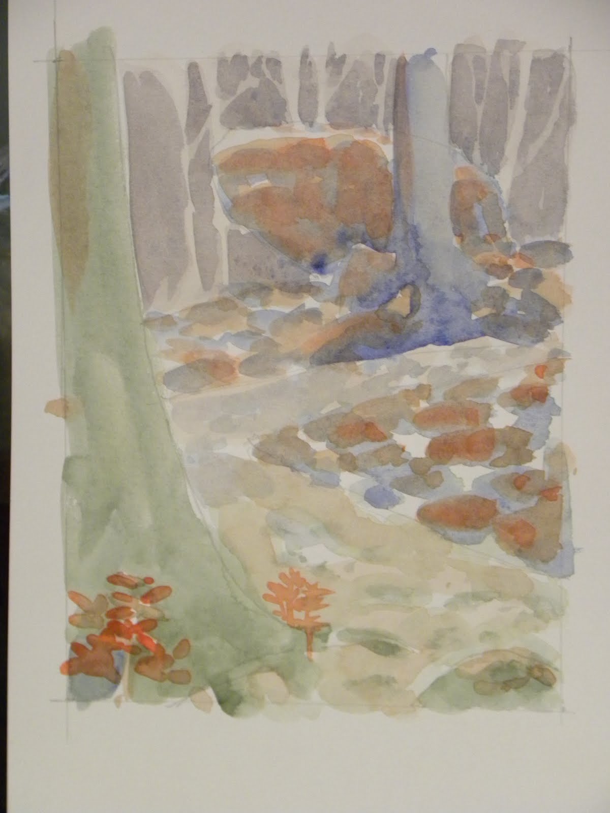
After the thumbnails I did three quick sketches at 6x4.5 on 90lb watercolor paper and began making color maps. The first map used greens, blues, and purples with orange accents. The green made up the foreground since its the warmest in that color set with blue in the mid ground and purple in the background. Typically I would go with purple in front of blue but because I was going to use the orange as the accent in the mid ground the blue popped out from the purple background.

 The second color map consisted of blue and orange only. I went with darker blues in the foreground and lighter in the back. The orange for the trail, big rock and highlights on the smaller rocks.
 The third color map was with yellow brown, purple gray and light blue.