Showing posts with label Watercolor. Show all posts

Monday, April 30, 2012

Out Driving

Out Driving
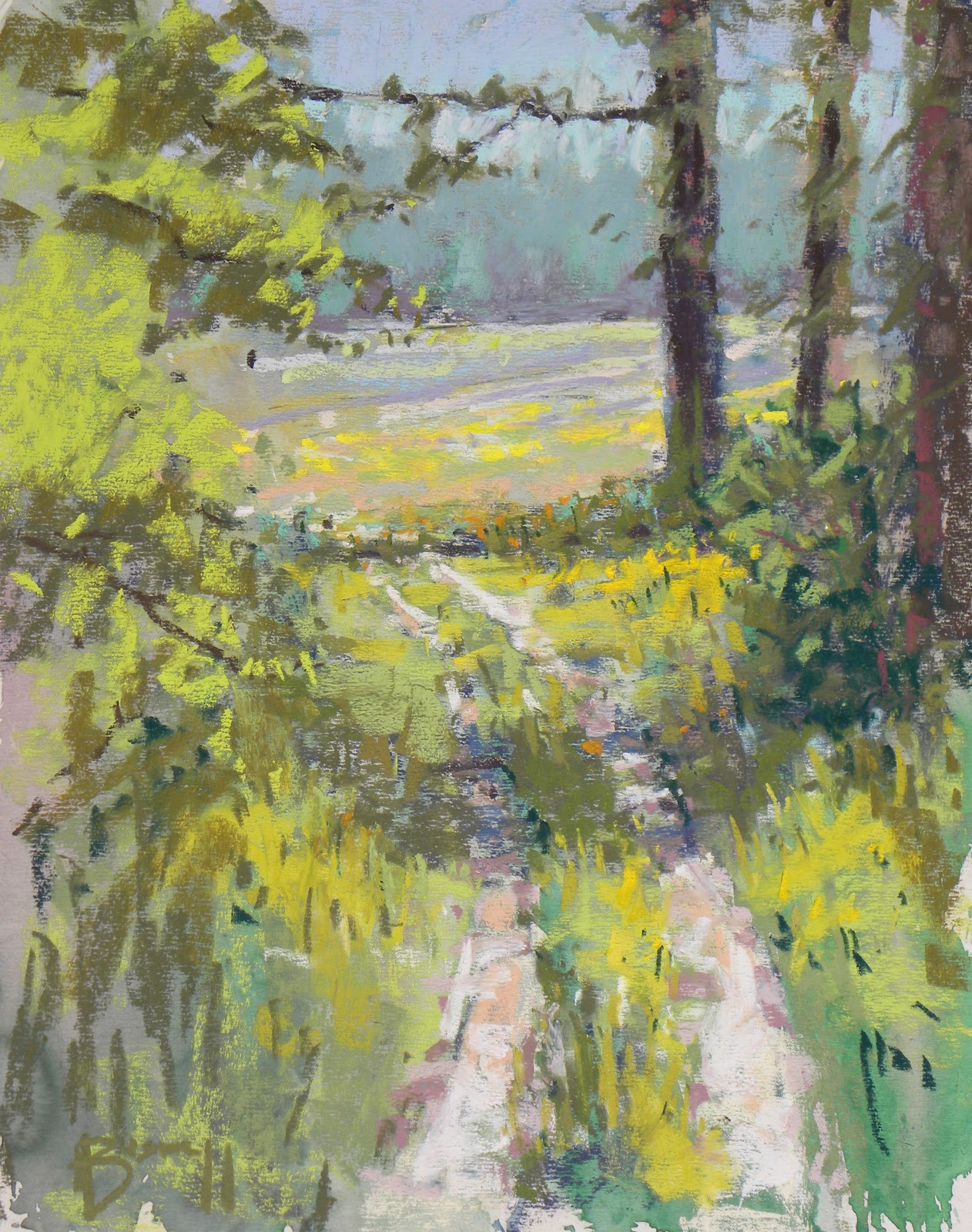
Today I had the best laid plans. I would drive to Franklin and paint down on the old square. After looking at the weather I started to have my doubts. It was supposed to start storming this afternoon and it was already an overcast day. When I arrived in Franklin there was a lot of people walking around down by the square which makes me not want to paint unless there are other people painting. It makes me feel like a spectacle when I'm the only painter. I just kept driving. I thought I would head down to Edinburg and paint with Rick Wilson but he was busy working so I headed home. On the way back I saw a side road that looked wide enough for me to pull off of so I took a left and went down it. About a mile off the main road I came across this scene. It was a trail back to a field that is probably going to be disked up within the week. While I was painting the owners of the land came up and thankfully didn't run me off. After finishing this painting I got another one in and talked to them before I left.  They were nice people and said I could come back and paint again so hopefully this is the start of a good little series of paintings from this farm. There is a nice stand of trees that acts as framing for a ton of paintings up on top of a hill to the left of this scene.

In the painting above I used a watercolor under painting on a handmade sanded paper panel. If the watercolor under painting has the values some what close the painting almost paints itself. Lately I've been working on letting as much of the under painting show through as possible and while the top half is almost covered, the bottom half of the painting has a lot showing through. I think getting better with value will allow me to stretch the under painting even further into the final work as time goes on.  Anyway its just a thought, tomorrow I will post the other painting.

Tuesday, November 1, 2011

Busy Days
Last night I was celebrating Halloween with my family at my aunt and uncles. After we went trick or treating with my daughter we set up talking until we were tired. I had planned on doing some paintings after the trick or treating but things didn't work out that way. So this morning after eating breakfast and getting everything ready to leave I did this quick painting of a tree outside their backdoor. This was the first watercolor I have done in two months and I wasn't sure if I even remembered how to do it. I kept this color palette simple. After working with oils, mixing the watercolors seems much more easy. This was done fairly quickly and I think keeping this little watercolor journal when pastels or oils is out of the question would be a good idea. After getting home I took some photos of the new paintings outside and am currently toneing some oil panels. With any speed I can get another watercolor done before my daughter wakes up.

Friday, September 16, 2011

Watercolor & Gouache
Today felt like a good day to get the watercolors out. The last time I started a new medium, my watercolors improved. I think it has something to do with seeing the paint in a different light. Before using pastels I only had watercolor to paint with so there was nothing to compare it to. After I started using pastels the watercolors started to become more understandable. I had another point to compare the medium and started to favor watercolor in man made objects and close ups. The pastels seemed to be better suited for natural landscapes. As I've developed my pastels toward a certain style the watercolors started to change as well. Now that I have oil as another reference the watercolors are starting to seem better defined in my mind. Working with oil there is no need to hurry or fuss over detail. It helped me relax and slow down when using the brush. While there is a certain speed required for the watercolors, I'm thinking I was over rushing things. The gradation change in the front trees would have gotten me worked up before but this time seemed different. I took my time and then used a heavier brush to push the pigment around even though it was slightly drier than typical. With it being drier it didn't push too much pigment like is typical and make the area almost bare. There is a lot of difference between oil and watercolor but my understanding of the pigments is starting to make sense. Also like last time I got out the gouache. There were areas that I thought needed lightened up and the gouache is very good for that. Mixing the gouache and the watercolor is still strange. It doesn't quite work out as well as I would think, but it is slightly better than last time. Just like pastel and oil, gouache is also another point of reference in the great scheme of painting. The plan is to learn all there characteristics and strengths. With time I think my paintings in the different mediums will start to mimic and become more like one another. Only practice and time will tell.

Thursday, September 8, 2011

Lesson learned from making mistakes
The past two days have been busy here. Yesterday nothing was posted so I wanted to get something quickly done this afternoon. Quickness in watercolor is a must during certain steps but not for my entire process. It leads to many disappointments and lots of frustration. Thankfully today's trials lead me to a new discovery about my thought processes.

This painting was derived from a thumbnail I did of photos from Mt. Baldy looking toward Lake Michigan. Like the recent dunes studies I was trying to get a good map for a larger painting. The first step of this painting was getting all the shapes in there mid tones and leaving the large middle tree white because it stuck out in front of the rest. It was what drew me to do the sketch. The next step was putting in the fencing and darks among the trees. I messed up and got everything too wet which caused runs. Then to make matters worse I tried to soften the hard edges as they dried only to smear and lighten the entire mass. I took a step back and let it dry for a bit, then got to the dark tree trunks and branches. The trunks and branches didn't turn out that great. When that was done I didn't know what to do with the white trunk that I had painted over. I remembered that I had gouache so I got it out and put it on the palette. Gouache is opaque like oil and that got me interested and decided to go for it. What has kept me from using things like gouache in the past has been people telling me that some how it is inferior. It is in the same tune that I've always heard that you shouldn't add black or white to your watercolors or any other supposed rule.
Lately I've been using new methods and refining others. Sometimes it is easy to forget that what other people tell you in a field like art is nothing more than a personal preference. If you are trying to mimic or achieve similar results as someone else then you should listen as closely as possible, seeing as how there are guiding principles in art. But as far as I can tell there are no set rules. I constantly search for new artist online, in books, magazines, galleries, shows, and museums and it always amazes me how many possible styles and ways there are to do things. The amount of styles would equal the amount of artist if everyone took the time to explore and develop there own path.
Anyway I used gouche to take back the middle tree trunk and while it wasn't outstandingly successful it did give me the courage to use it in the sky and dunes which I liked. I also learned that by mixing the gouache with a watercolor you can tint it and get it closer to what you want. Now instead of looking down at gouache or any other medium for that matter, I see it as another way at getting the results you want. Will I always use gouache in my watercolors? Probably not, but it does open up new possibilities if I want the luminosity of watercolor and the opaque qualities that it can bring to the painting.
Friday, September 2, 2011

More of the Dunes
After finishing the dunes painting from a few days back, the value sketch for this study was next in line. This is a view from the top of Mt. baldy at the state dunes. There was a lot of overcast that day and it helped emphasize the atmospheric effect on the background. With this study I'm happy with how the mid and background turned out. The values and colors give the scene a sombering effect which plays well with this large industrial plant shadowing behind these beautiful dunes. The foreground didn't turn out as well as I would like. The amount of water on the paper or lack of got a little out of control as I was hurrying to get in the darks before the paper completely dried up. I enjoy the composition of the scene and think it plays out well. The trees in the foreground overlap into the mid-ground and the mid-ground trees overlap into the background. This gives the scene a soft transition from the bottom to the top which works with the horizon being where it is and the perspective from up high. I'm happy with the values and this will be a good map for a large painting.

Monday, August 29, 2011

Dunes revisted

So a couple of days ago I decided to start adding landscape elements together in watercolor again. This painting is based off a photo from the dunes paint out. I thought it was already a strong composition although now I have noticed a few things I would like to change about the layout. The biggest change I would make is the large mound and pine tree. They should be moved further down the hillside starting right where the background trees end. The foreground trees should be better defined but that's for another painting. As far as what I like about the painting, the sky is one of my favorites. Skies in watercolor can range from a simple wash to a complex series of clouds. This sky is of a sunset which I have rarely done and it turned out surprisingly well. It has a subtle gradation change and the clouds are slightly darker in value which is typically not the case during any other time of the day. The grasses are another area of interest. When a person thinks of painting grass it sounds simple and easy. It just so happens that grasses are one of the toughest things for me to paint right now. So this painting has given me a couple of ideas on other landscape elements that I need to spend some time practicing. After this painting I need to work on trees as well.

Overall I like the effect of the painting and it is fairly successful of what I was trying to show. It has the warms in the left and it quickly becomes cooler as you move to the right. The warm colors draw you in and then you begin to wonder into the cooler areas. It reminds me of my time at the dunes. It was beautiful and exotic for being in Indiana. The warm sands and lake sunset initially caught my attention but it was the trees, grass, and hills that kept calling me. Typically that warm feeling draws people together and that is where they congregate which is wonderful but eventually people seek to venture out alone for that solitary place where mysteries are waiting. I'm thankful painting allows me the time to seek out these places and ideas. With time I will become better at showing them and perhaps it will be something that others can relate to.

Thursday, August 18, 2011

Painting Skies
Today I went with another landscape element that is one of the most if not the most important part of a painting, the sky. This particular study was practicing a sunset. I like the wispy clouds and how they are darker than the sky. Typically when I do skies the clouds are the lightest things on the paper. Usually they are negative shapes while the sky is a positive shape but these are backwards. After doing the studies I realized that I should have added some rocks but that was after the fact. Also these sky studies are only 5x7 so it is hard to really get rocks and sky into the same painting unless the rocks are huge boulders or rock faces. Which could have been easily the case if I had thought it out ahead of time. Tomorrow I will practice a new landscape element and try and do a larger study piece at the end that combines rocks, a sky, and the new element.

Wednesday, August 17, 2011

Today's plans foiled
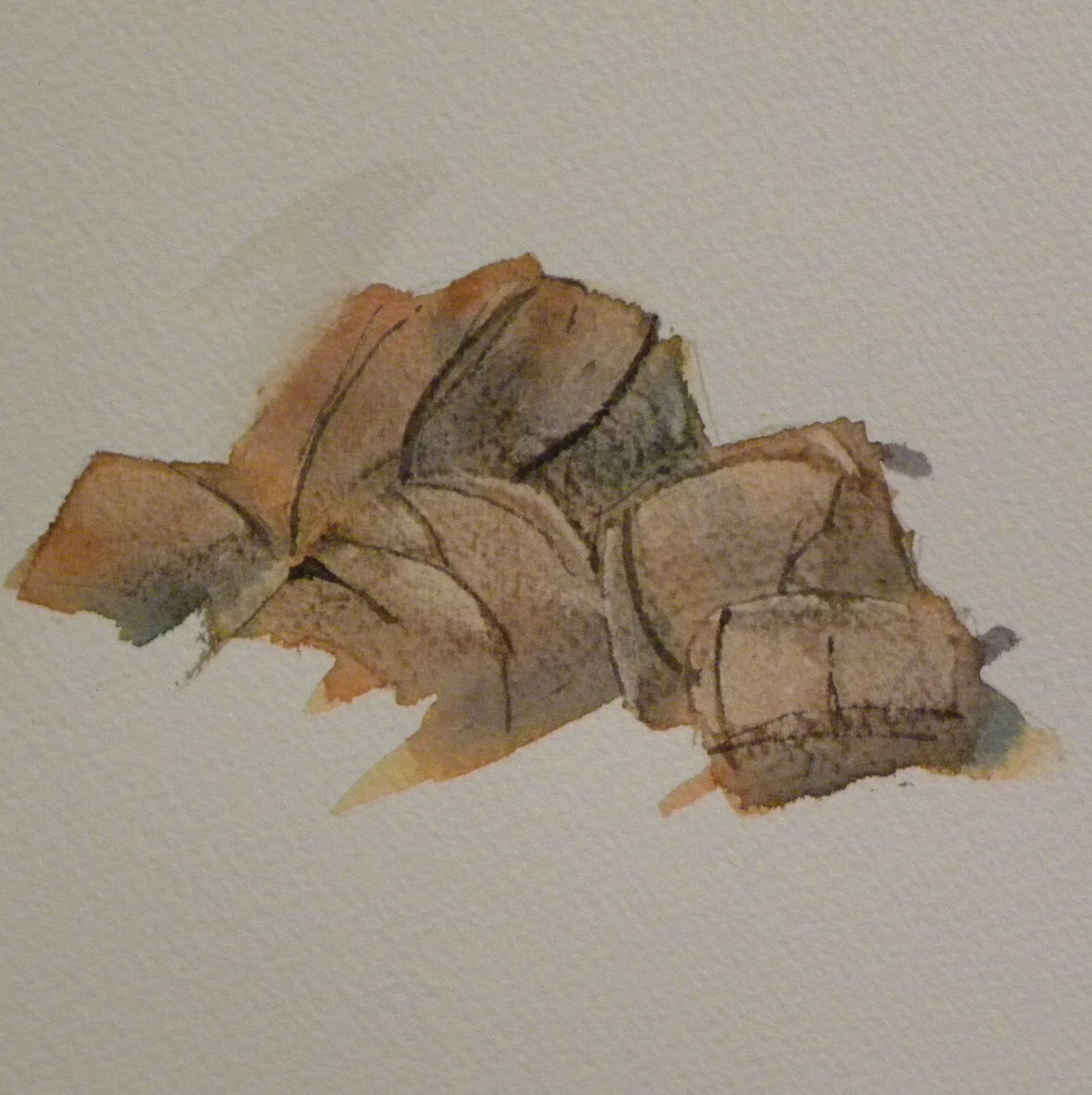
 Today I had planned on continuing the abstract series and was foiled by muddy paper. The other papers my daughter had drawn on were cheaper and lighter papers. That coupled with her poking holes in most of the drawings made me take another route today. These are two of the many rock formation studies that I did today. They are a lot of fun to do and are only 4 by 5 inches at max so I can get a lot of them done. This got me to thinking I should do a mini landscape elements series. If it wasn't so difficult to do pastels in the studio right now I would continue on with the old series but as things stand I'm going to have to put the pastels on hold. These small paintings will be easier to do on a daily basis and will help build up some knowledge on these individual elements so it is easier to put them together in larger paintings. I've already got a lot of river and waterfall paintings that have been on my mind but I wasn't sure how to do the rocks. Once I get water and trees down those paintings should flow out.

Tuesday, August 16, 2011

Good problems to have
Today my daughter got into my watercolor paper and took some pencils to town across it. She made some interesting marks that didn't look recognizable so I decided to make an abstract out of it instead of erasing it. I'm happy with how this turned out with all things considered. Typically if she gets a hold of something that she isn't supposed to it doesn't end well. After she did it I let her have a few more pieces of paper to play with. If I have time the next couple of days it will be devoted to completing her abstract series. Painting abstracts helps me get over the hump in the road that occasionally happens. After the last couple days of working on pastels I remembered how hard they are to do in the house. Pastels are much more suited for working outdoors or in a studio that is set up to extract the dust. Thankfully Ron Burgess  http://ronburgessart.com/ (you should check out his work) showed me how to make a quick trow for collecting fragments and most dust but somehow I still seem to make a mess.

Tuesday, August 2, 2011

Field study
The edge of tree lines are always fascinating to me. There is sometimes a tree that stands out away from the rest and has a character of its own while the rest of the trees become the woods. When I will drive tractor for my dad during planting season I'm always watching the tree lines with their shapes and colors. They change the entire time you are driving. Every time you turn around and go back you get to look at it from afar all the way to almost touching it (and you will if you're not paying attention). Also depending on how big the field is, you can see it change over the course of an entire day. During the morning the entire front side of the tree line could be lit up and 5 hours later everything but the top and largest trees sticking out are in complete darkness.
Anyway watching the scenes around me always kept me from getting bored while out there. This will be the last daily watercolor in this series. I'm deciding to cut the watercolors short and move on to pastels. It is always excited to be working on them and hopefully it shows in the upcoming paintings.

Monday, August 1, 2011

Kentucky Hills under paintings
 In yesterday's post I mentioned borders was having their store closing sale. Last night they had taken the prices down even further. I bought Richard McKinley's Pastel Pointers. I follow his blog on the artist network and have been wanting to get his books for a while now and with one on sale decided to pick it up.
If you look at his work the first thing you might notice is the under painting that shines through his pastel application. I've been using under paintings for my pastels for a while but only using pastels with turpenoid for the medium. Today seemed like a good day to try a watercolor under painting, so I did two of them. The first was one that I wanted to finish with watercolor and the second with pastel. He talks of arranging shapes in value masses that way you don't jump around the painting and exaggerate certain areas to an extreme. The reason I chose to do the under painting that would be finished in watercolor first is because while the pastel under painting is drying the watercolor painting can be quickly finished in a loose style. Then when the watercolor is done you can start on the pastel already warmed up. This seems like a good strategy for now and I will use this for plein air until I'm burned out.
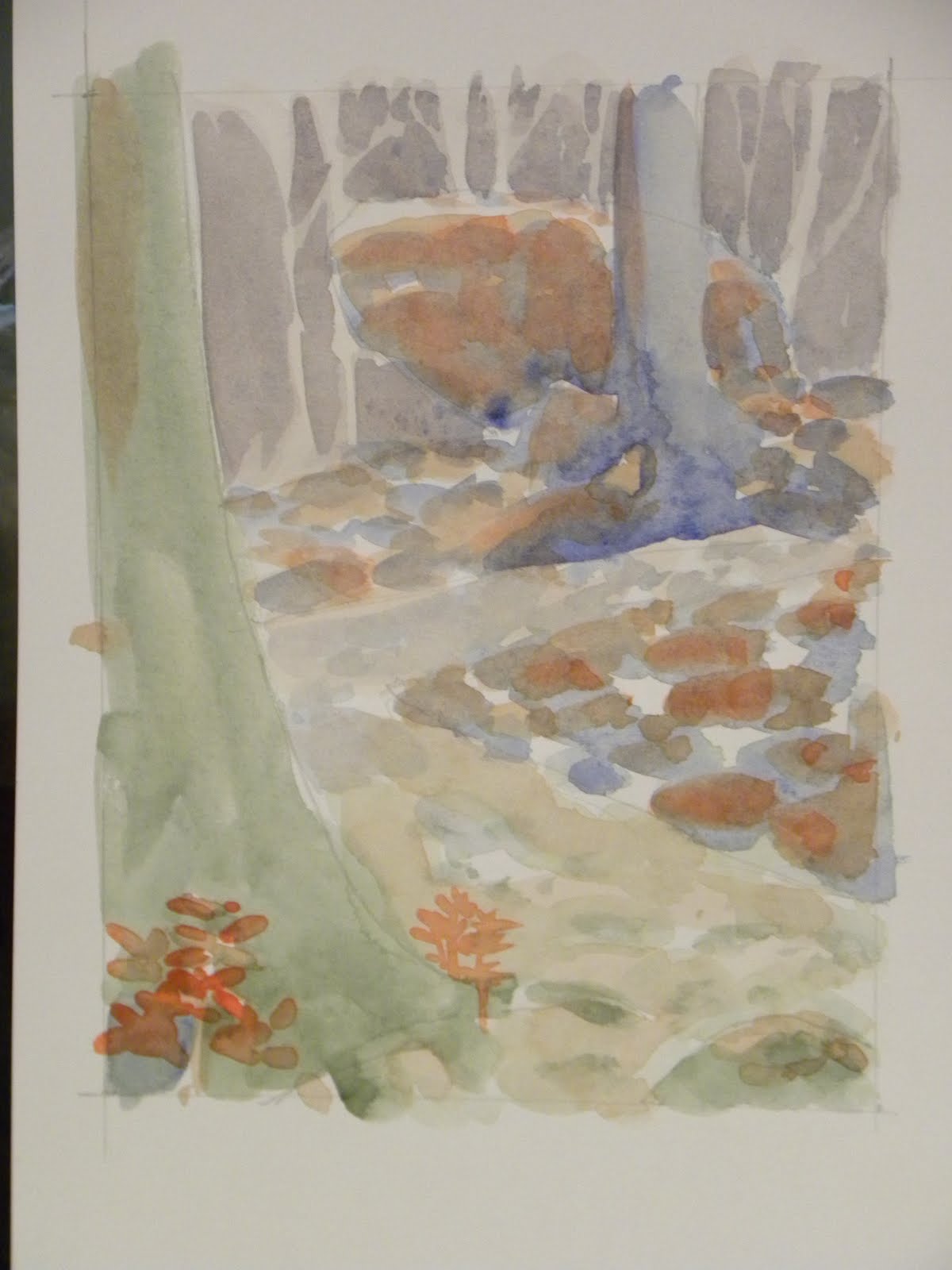
This is the watercolor under painting for the watercolor finished painting. The thought behind this was to get everything massed in while staying at the lighter end of the value scale for the masses that way they could stay as highlights and be darkened where needed. I like the way the hills roll down in Kentucky. It reminds me of the car trips to see my mothers side of the family. I think the dark value masses frame the rolling nature of the hills well in this painting.
This is the under painting for the pastel that I will eventually get to during the second half of this round of paintings. I tried to get at the average value for the masses on this one. Also the value map changed on this under painting from the previous. I decided to push the tree above the foreground trees back to showcase it. The shape of it was interesting as it was the only one that fanned out and let a lot of the hillside behind it shine through.That will be a lot easier for me to show with pastels at this point than watercolors so i went that way in this painting.
Anyway if you are a fan of McKinley's I would recommend getting the book. Most of the stuff on it can be found on his blog, but it is nice to have a physical copy to flip through when you need some motivation. Also the DVD included with it was great and the ideas sink faster when you see him explaining them.

Sunday, July 31, 2011

Pulling ahead
Today I worked on a scene from a recent trip to the smokey mountains. I was wondering what it would look like in the fall so I decided to go with autumn colors. After drawing a few thumbnails and value studies I drew it out on watercolor paper.
On a side note, borders is going out of business so I went in to look at the art section. Sterling Edwards has a book that I have been wanting to get for a while and they have it. I haven't bought it yet but I did have a few minutes to thumb through it. I'm a fan of his work and he is an advocate of using stiff bristle brushes for watercolors so I decided to go in that direction with this painting. The sky and top mountain tops were laid in using a 1" gesso brush which turned out very well. The third mountain top is too dark, but I could always darken up the closest trees to offset that. I liked how the grass in the foreground turned out along with the small minivan-suv and semi. The truck out in front was another story. The brush got away from me while I was putting in the darks and again when I was laying down the paint for the trees behind it. Anyway I'm going to go pick up that book as soon as the sale gets better.

Thursday, July 28, 2011

Preparations for a large painting
 Last night while looking through the remaining photos in this round of paintings, this one is going to be a larger painting. So for today's daily painting I decided to do thumbnail sketches along with three color maps. This is from the smokey mountains. When Cristina and I were walking up this trail there was this huge rock on the left side of us that looked as if it could come down at any second. The main trail kept going up the hill but there was a small trail that went up to the rock. Apparently some people like to get up on the lip and wonder what it would be like to be a stain on the forest floor. I took the photo and got back to hiking up the trail.
The value sketches are at the bottom of this post. I started by doing a thumbnail of how I would like it laid out. Then did a mirrored version with some slight alterations. Typically I will do three or four layouts with mirrored version but I really liked the first one so I went with it. Then I did a value scale thumbnail below it. Again I liked the first one so didn't go on with more.
After the thumbnails I did three quick sketches at 6x4.5 on 90lb watercolor paper and began making color maps. The first map used greens, blues, and purples with orange accents. The green made up the foreground since its the warmest in that color set with blue in the mid ground and purple in the background. Typically I would go with purple in front of blue but because I was going to use the orange as the accent in the mid ground the blue popped out from the purple background.

 The second color map consisted of blue and orange only. I went with darker blues in the foreground and lighter in the back. The orange for the trail, big rock and highlights on the smaller rocks.
 The third color map was with yellow brown, purple gray and light blue.

Wednesday, July 27, 2011

Looming Clouds
If you notice that my paintings contain a lot of power lines, cars, and fields you would have a good idea of what I see on a regular basis. Those three things are everywhere around me and I want to be able to portray them correctly. Each time I paint them they seem to get easier to represent. Whether they look better or not is another story. One of the things I'm working on is to go with my instinct and to be decisive in my paintings. For a while I was having a hard time deciding if what I was doing was going to look good, and more likely than not it doesn't matter because my technical skills are lacking.
I'm happy with how the horizon turned out on this painting. It seems to really be pushed back there. Everything up to the red barn looks like it falls in place. The grass along the road as it leads up to the foreground could have gotten larger, been represented better and the field a warmer yellow. One mistake I seem to make more than I should is under estimating how much paint is needed to fill in a shape. The road is a perfect example. The center of the road between the two yellow lines is darker than the left and right sides. I started with a color already mixed and ran out after I got up to the next hill in the road. When I started to mix the color for the left and right, the color in the middle had already began to dry. When watercolor dries the color lightens up. That is why you have to make colors darker than you think you need. When I laid down the sides of the road they were the same color as the center but seeing as the center was already drying the sides turned out even lighter.
Anyway it was a good learning experience. It will turn out better in pastels.

Tuesday, July 26, 2011

Ninja Star Comic


This past fall I had an idea for a comic that I never got around to pursuing. So now I'm going to make the time to sit down and do some drawings for it. The comic is titled Ninja Star. When I get further along I will start another blog based on the comic. My plan is to do a weekly series along with every few days having concept art put up. The comic will be fairly graphic so that's why I wont be putting it up here. Anyway here is teaser image of ninja star launching himself through a bubble screen. Today I sat down and penciled it on watercolor and started painting. Over the next couple of months I will be writing and getting a head start on the comic so when I do release it I can move them out fairly quickly.
Driving home after the rain
This is supposed to be driving back home from Ripley county on highway 50. The sun had just come out after a rain storm and it made everything glow. This is only a small study but I think it conveys the mood fairly well. The tires on the car in the front gave a laugh after I realized what I had done. It looks like a tank car. Other than that the scene turned out fairly well. I think when this is turned into a larger painting I will play with the road a bit and maybe add a few elements but as far as overall atmosphere I like this a lot.

Monday, July 25, 2011

 More Barns


Today I painted the same scene twice, with differences in the cropping and styles. The first painting is a tighter style that is painted from the distance to the foreground in layers. The second is painted darkest values to lightest and is a looser style compared to the first. I think the second painting has more potential for further paintings but the first turned out better this time. The depth reads well in the first painting. The second painting I learned more from. The tree should have a better defined shape. It could read better against the high contrast small barn behind it. Also the shadow needs to be defined better. When the pastel version of this painting is done I will go with the second painting as a template and alter it from what I've learned. I'm happy with how they turned out given the short amount of time spent drawing and finishing the paintings.

Thursday, July 21, 2011

Behind SALI
This is a little creek that runs behind the south side art league building. The day this picture was taken the sun was blinding. Thankfully there are quite a few trees back there that shade part of the area. Before I started painting this I went over my guidelines and decided to add another item to the check list. I will only paint using a small travel palette. This keeps color choice simple and will help me get to know colors better. There is an initial wet in wet was wash followed up by darkening some areas. The trees were left white until I was done with the land and background. After that I put in the trees and dragged them down for a reflection. There are a few problem spots but it reads well from a few feet back.

Tuesday, July 19, 2011

Red Barn
Today I painted a red barn that I saw out west of Indianapolis. It was a simple picture with not a lot going on so I figured it would be good practice for getting used to these brushes. There was water spilled on the left tree and the bottom layer of grass could have used more interest. The bottom should have been raised on one side and lowered on the other. For now on I wont let a straight line run horizontally completely across the page. It should be broken up or only go across part of the way.

Monday, July 18, 2011

More Power Lines
Today I found a mop brush that I must have gotten when I first started painting and forgot about it. It was stashed away with some of the other art stuff that I never unpacked. What better way to follow my guidelines than to use something I didn't know I had.
The sky was done using the mop. It holds so much water. It should have been out being used before today. When I got to the bushes and power lines I used an old number 8 round that has no point. I flattened the end out and tried to use it that way. While there are parts that could be improved, overall I like the painting. It will be a good guide for its pastel counterpart.